How the ShogunAI logo was made
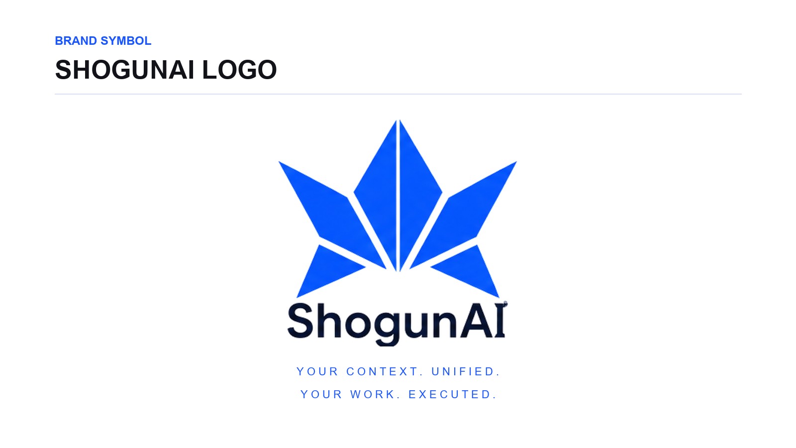
A kabuto, origami, and AI — three ideas compressed into one mark. Not a drawing of a samurai: the structure of a helmet extracted, rebuilt with the geometry of folded paper, and cut back until it still works as an app icon.
The name ShogunAI probably brings a shogun or a samurai to mind first. That is not what we set out to draw.
Swords, family crests, armour, ink, red and black — reach for those and expressing the name is easy enough.
But this is not a brand about history. What we are building is software that changes how work gets done.
So the first question was how one mark could be Japanese without looking old, and unmistakably about AI without looking like every other AI company's logo.
Take the helmet apart rather than draw it
The starting point was the Japanese kabuto — though we never drew the helmet itself. The first question was why a kabuto reads as a kabuto at all.
A few things carry it. A strong axis through the centre. A silhouette that spreads to either side. A sharp form pointing upward. And a base that holds the whole thing steady.
So we stripped every ornament off the helmet and kept only that structure. Not a reproduction of the shape — an extraction of the geometry that makes the shape legible. The logo was designed from there.
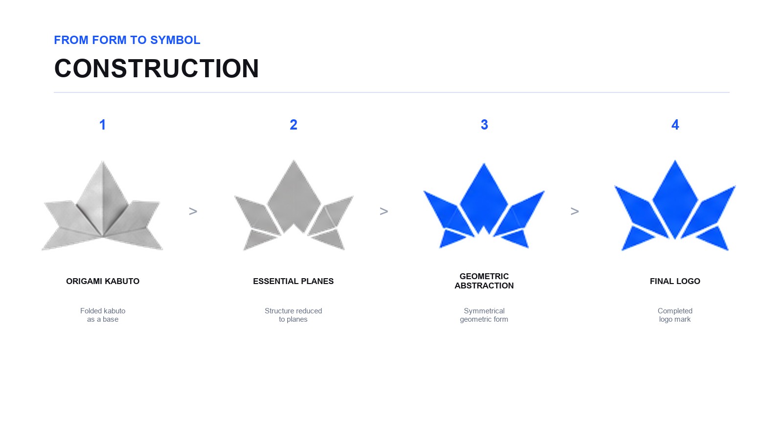
Fig. 1 — From the structure of the helmet, to flat planes, to a symbol.
Make origami the design language
Origami came next, and not because it is decoratively Japanese. A single sheet divides along its folds into planes, and the arrangement of those planes produces a form with depth: complex structure out of the simplest material.
It has a visual grammar too. Straight lines. Planes. Angles. Symmetry. Empty space.
We did not draw origami. We used its structure as the rule set: no curves, no fine ornament, the whole mark resolved into a handful of flat planes. Under that rule the traditional silhouette turned into something more abstract, and more digital.
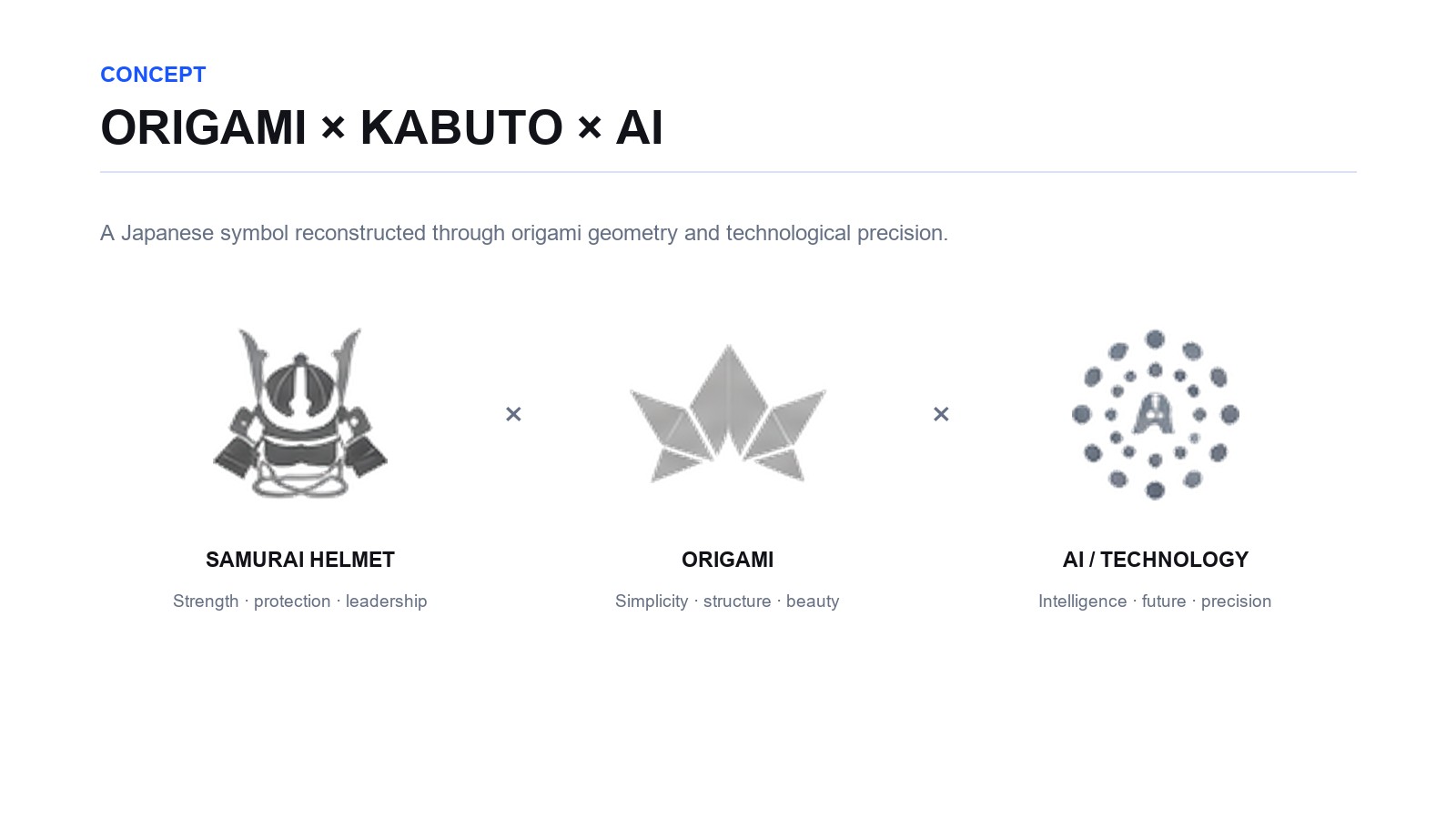
Fig. 2 — What the mark inherits from kabuto, origami and AI.
Kabuto × Origami × AI
Three sources, then. Kabuto. Origami. AI.
From the helmet: strength, and a centre. From origami: composition in planes, and a particular Japanese sense of beauty. From AI: geometry, precision, abstraction.
We did not add them together. What we actually did was subtract. Strip the ornament from the helmet. Strip the literal motif from the origami. Strip the robots and brains from the AI. What we were looking for was the shape all three still share once everything obvious is gone.
What remained is the current structure: one apex at the centre, planes spreading to either side, a base carrying the whole.
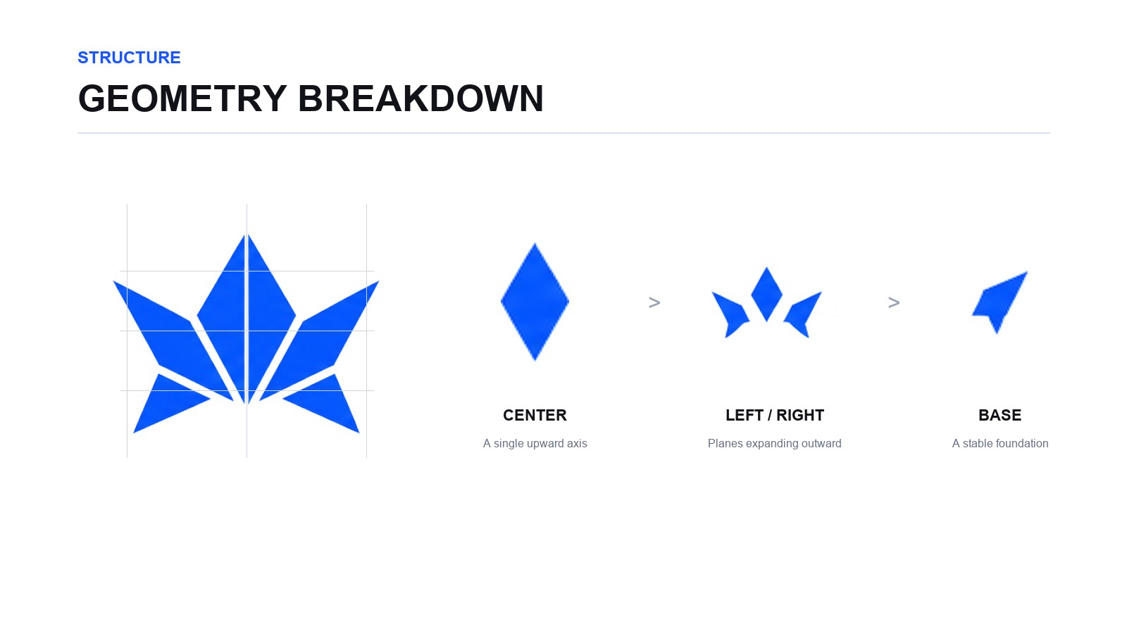
Fig. 3 — A central axis, planes spreading outward, a base beneath.
One strong axis down the middle
The centre is the most important part of the mark. That plane is taller than the ones beside it and its apex points straight up, which gives the whole logo an axis.
Spread alone would let the silhouette drift sideways. Lifting the centre pulls the eye to the apex instead. Stable, and still moving upward — still, and yet pointed somewhere. To hold that tension the central form is drawn narrower and sharper than the rest.
The spread is what gives it scale
Against that centre, the side pieces open outward. They supply a horizontal steadiness that plays against the sharpness in the middle, and they are the reason the mark still reads as strong when it is small.
Each side is split into several planes rather than left as one. Those boundaries give a flat mark the depth of folded paper — presence as a helmet, sharpness as a technology company, out of one structure.
The white is part of the logo
In this mark the white counts as much as the blue. A thin margin of white runs between every part, and it is not there to make the parts easier to see.
The white is what lets each plane stand on its own and read like a fold. It also gives the mark speed and lightness. Join all the planes and the form gets heavy — one solid mass. Separated, each part stays legible while the whole still reads as a single symbol.
Drawn areas are not the only thing that makes a shape. Empty space makes it too. In this logo the negative space is designed, not left over.
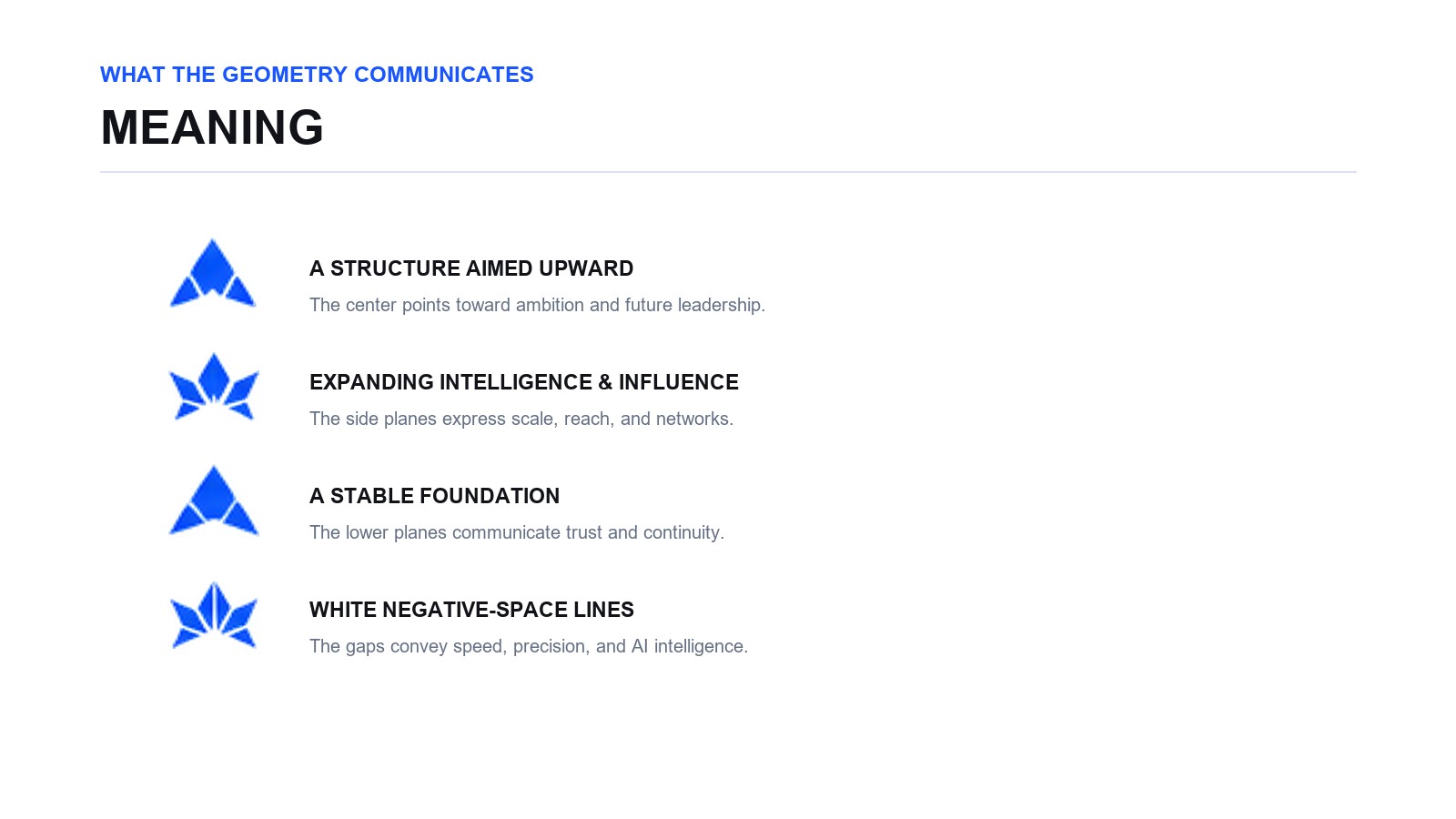
Fig. 4 — Rise, expansion, stability, space: what the form is carrying.
Not a traditional palette — Shogun Blue
Given the name, black, red and gold were all available. We chose a vivid blue instead: Shogun Blue, #1A56FF.
The reason is where we wanted the mark to sit. The form has its roots in Japan; the company is pointed at the future.
A vivid blue reads as technology, intelligence, speed, digital. Colour is what finally lets a traditional motif work as contemporary software.
The form comes from Japan. The colour comes from where we are going.
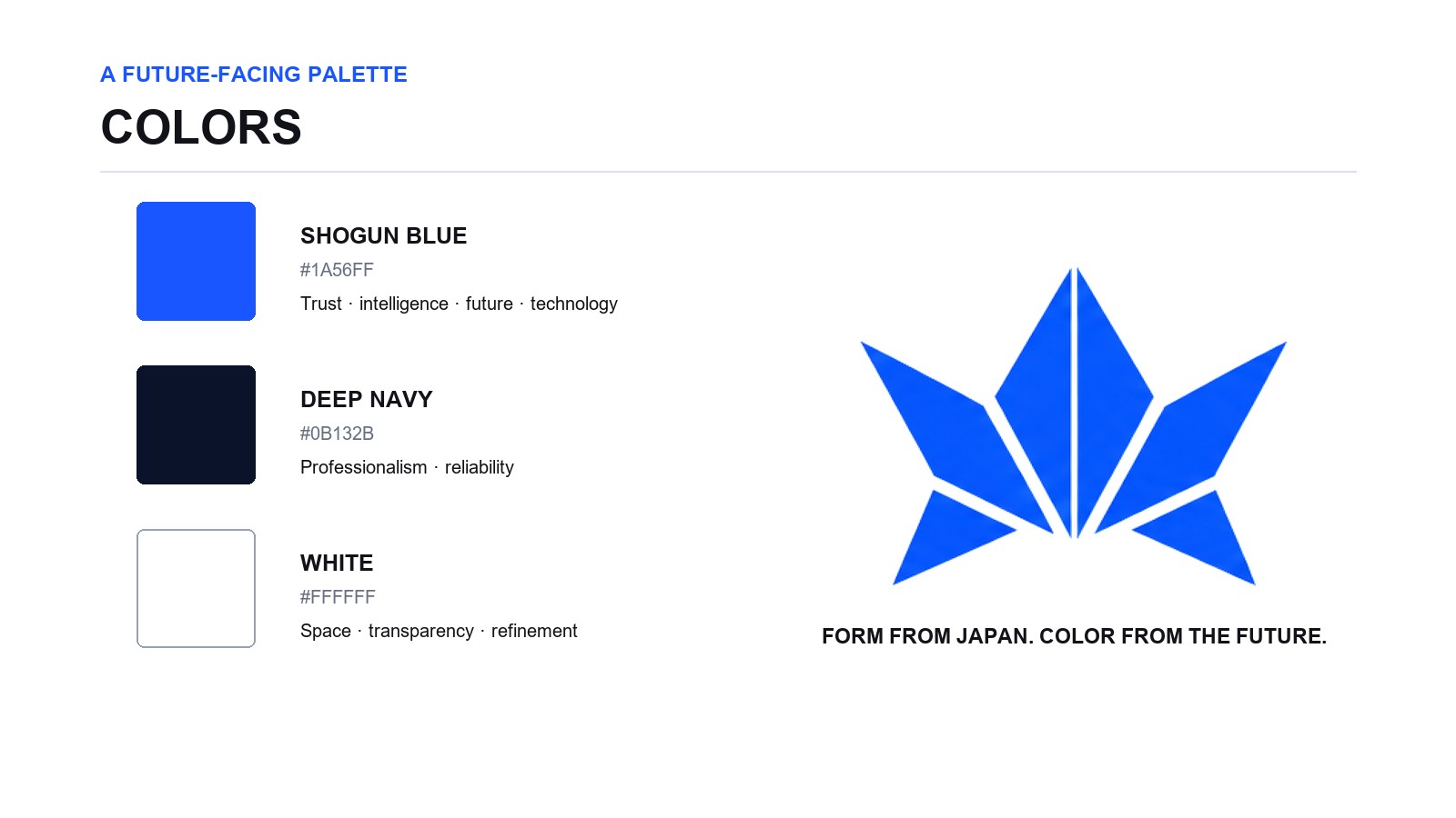
Fig. 5 — A forward-looking palette built around Shogun Blue.
Not a logo — a part of the product
A mark that only looks good large is not finished. Because this is software, the website is not where the logo appears most often.
App icon. Browser tab. Navigation bar. Dark mode. Monochrome. It has to be recognisable as ShogunAI inside a very small square.
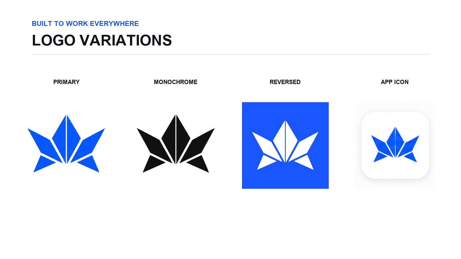
Fig. 6 — Colour, monochrome, inverted, app icon.
So the final mark drops as much fine detail as it can. A few large planes carry the form, and the central apex and the outward spread survive at small sizes.
The silhouette holds where colour is unavailable. It works on white and on black.
Designing the logo meant designing for the places it would be used, not just the mark itself.
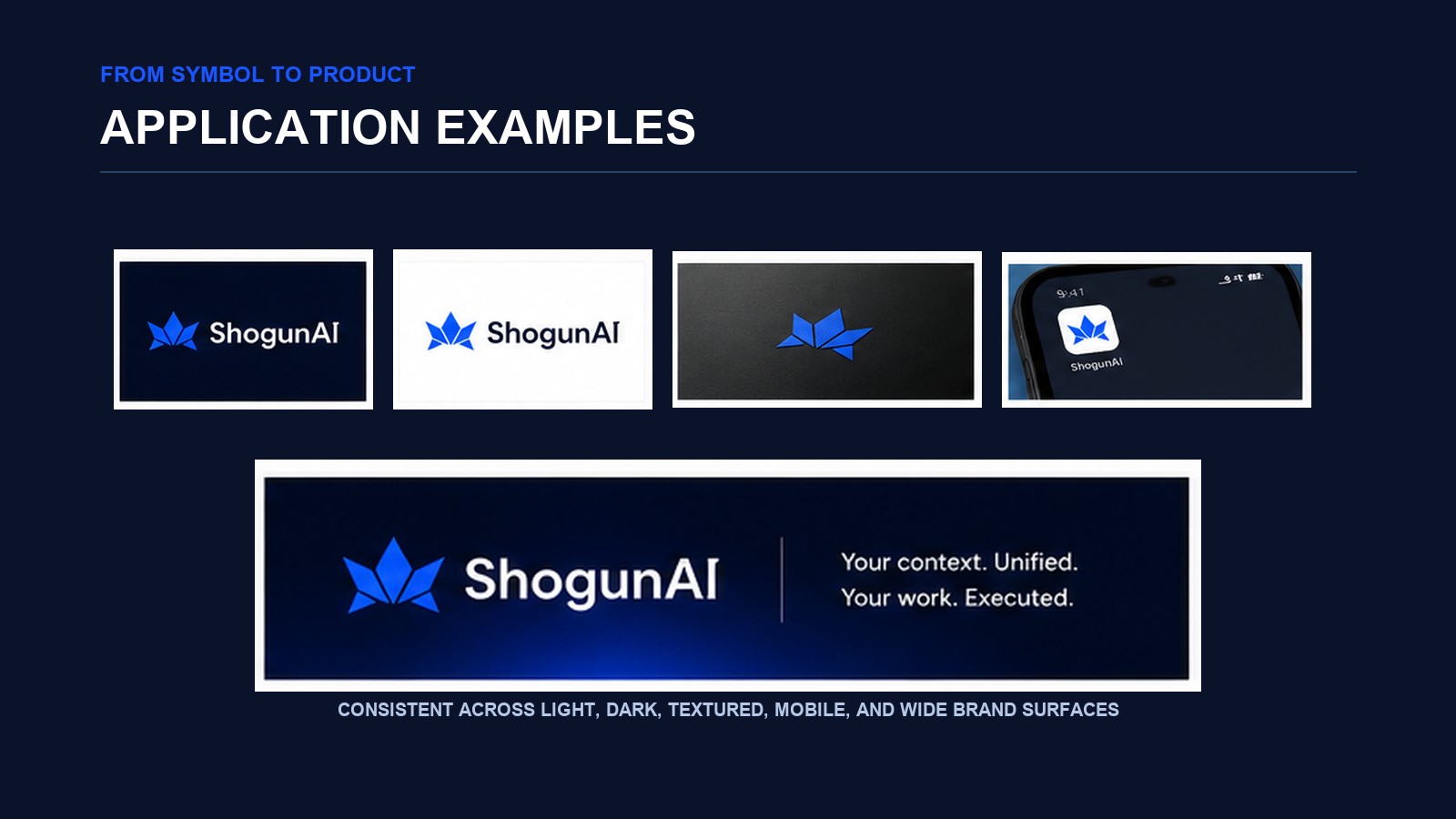
Fig. 7 — Web, dark UI, app icon, brand lockup.
Compressing ShogunAI into one shape
The finished mark looks simple: an apex in the middle, a few planes spreading out from it.
Getting there meant observing a helmet, taking its structure apart, translating it into the language of folded paper, abstracting it until it worked for an AI company, and cutting it back until it worked as an app icon.
We were not trying to draw a shogun. We were trying to abstract the structure of a Japanese helmet, rebuild it with origami geometry, and turn it into a symbol for future software.
That is where the ShogunAI logo came from.